
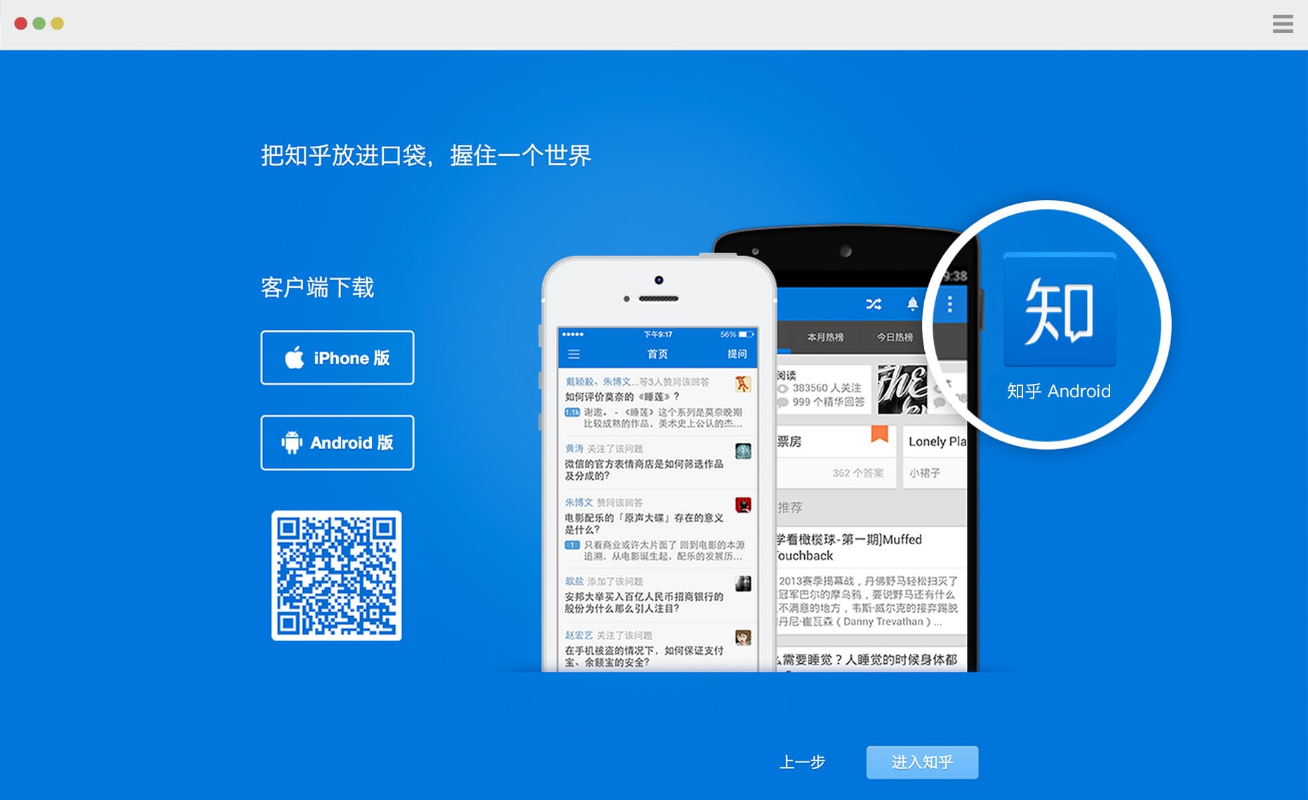
Zhihu is a Q&A Social Community, and Zhihu for Android is the mobile app of Zhihu.com on Android platform. People could talk about any professional, academic or online trending topics there. With over 2 million registered users and 200 thousand active daily users, it is one of the most potencial and professional Q&A social networks in China. We created a stage giving users an oppotunity to speak out their own opinions & stories and communicate with other people in a serious and professional attitude.
I was the Product designer, also worked as an interaction designer and visual designer on this project, working with the mobile team of Zhihu, a bunch of incredibly qualified and jolly people, on a tight deadline.
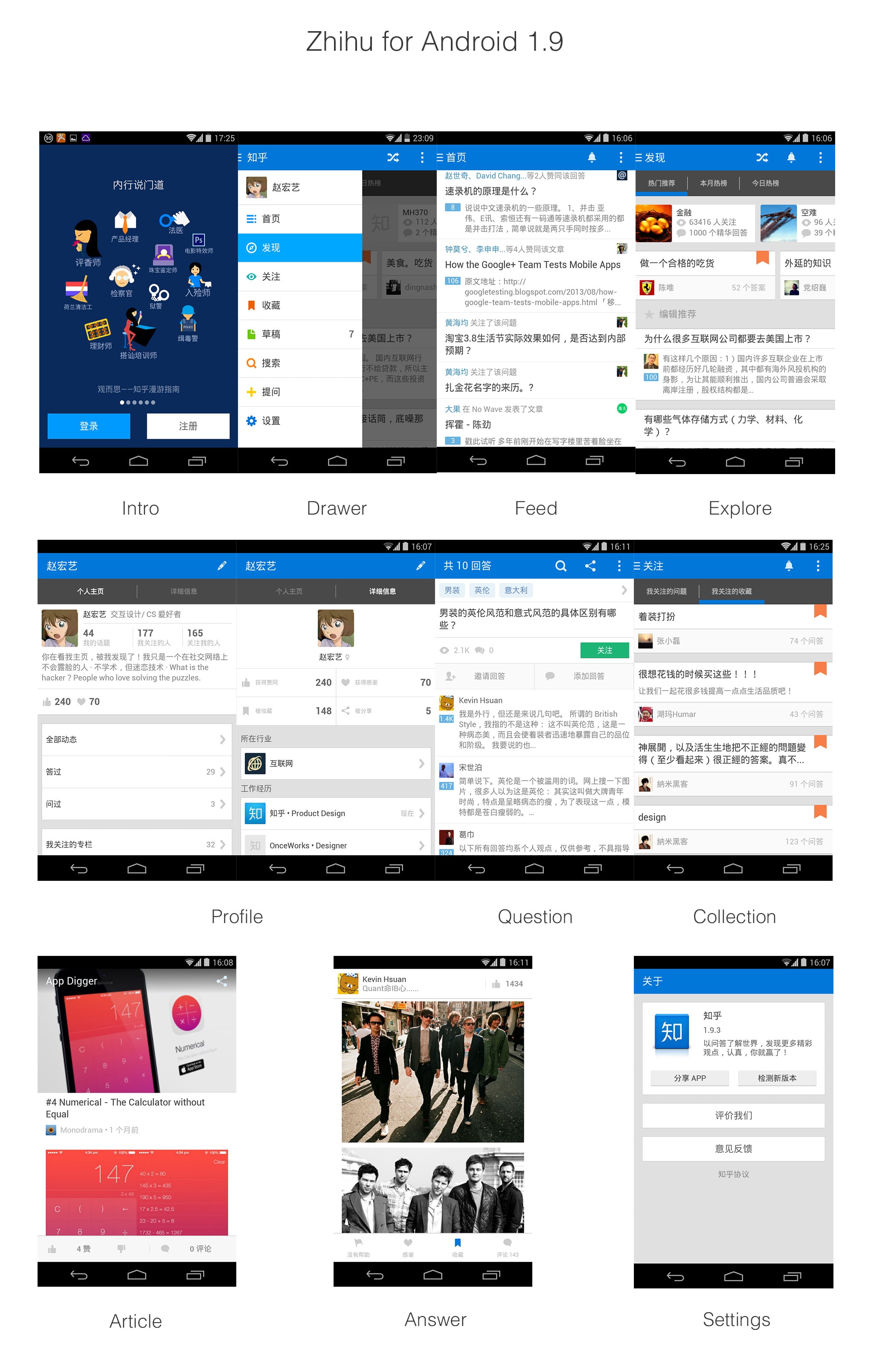
All pages followed the Guide of Android Design and our heart.
In this Project, we wanted to update some parts of Zhihu App, including the information structure, compose type, icons and buttons etc, in order to improve users' especially the new users' experience.
In the beginning, I analyzed new users' behaviors and habits via Email, Zhihu.com and People in my daily life. I chatted with users or potential users online & offline, collecting their feedbacks. After that I went to CBD and interviewed several potential users. When they used the old version App, I observed the interaction between the users and interface, listened to their expression and recorded these details in my notebook, trying to find what confused the users, what dlighted the users, and what the value of Zhihu is.
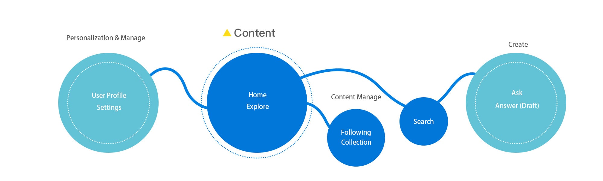
After the Users Research, We found that people usually use our app when taking metro、staying on the bus、waiting in a queue or even staying in restroom, all in all , they used Zhihu App on mobile in pieces of time , and people love reading things they are interested in everyday. We need a clear way to present our valuable contents in history and updates. Thus, I have to make Zhihu app more clear and lightweight so that users could get the main idea of the information as soon as possible and be glad and patient to read more news and interesting stuff from Zhihu. Besides, we need to introduce who we are ,what we can bring to people in a clear and brief way to new users. So we got several directions to improve the experience of Zhihu App: navigation, layout, users guide, digging out more valuable contents.
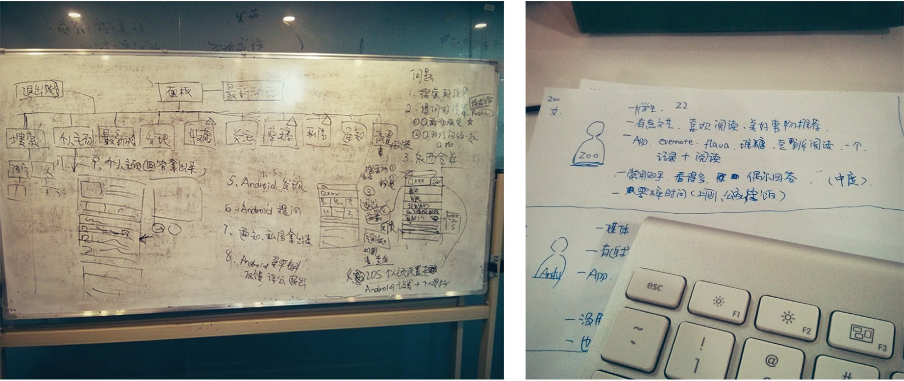
Built the persona and functional structure according to user’s scenario
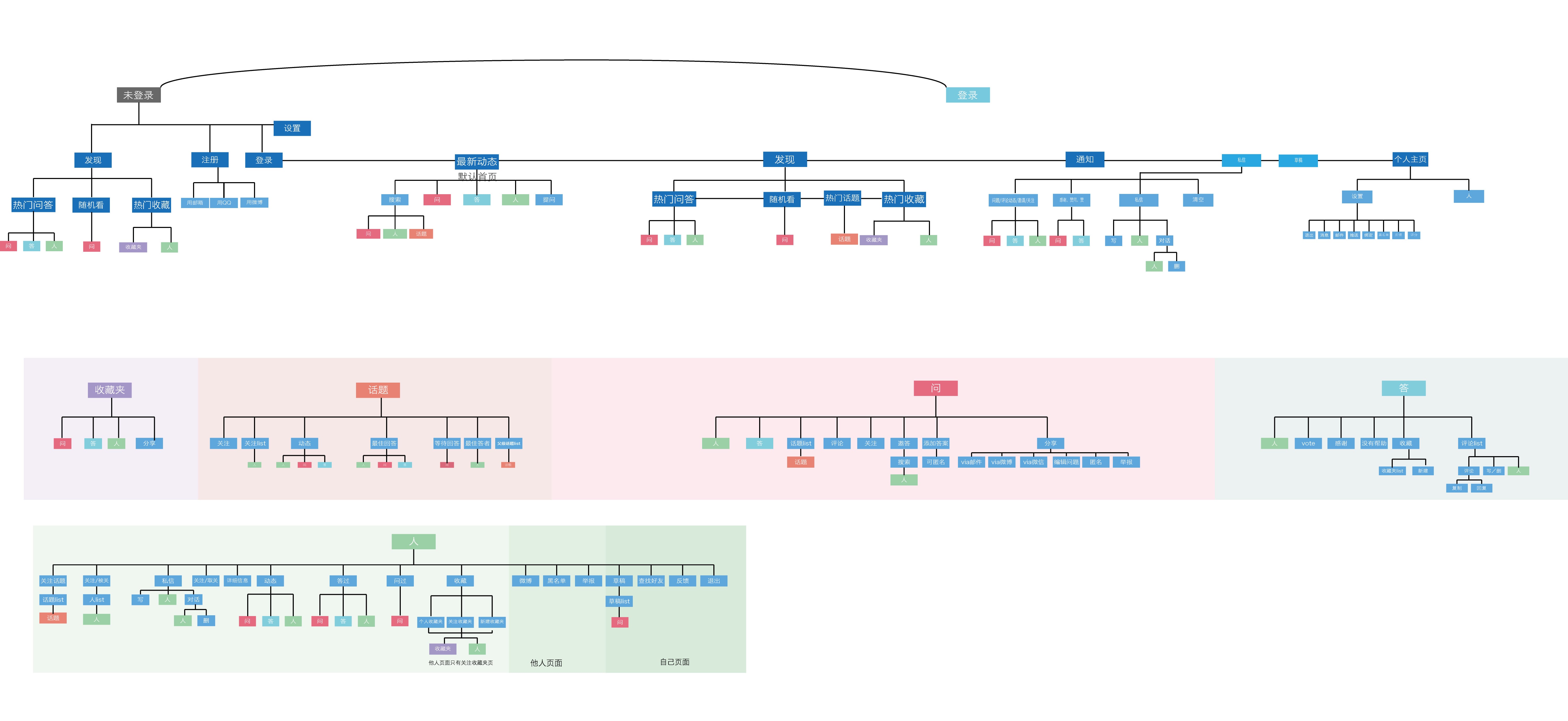
We built the structure of navigation according to the information structure of Zhihu App and Android Design Guideline .We revised it over and over again aiming to make its sequence more clear & logical and easy to touch.
I selected several important parts and classified them by priority and function
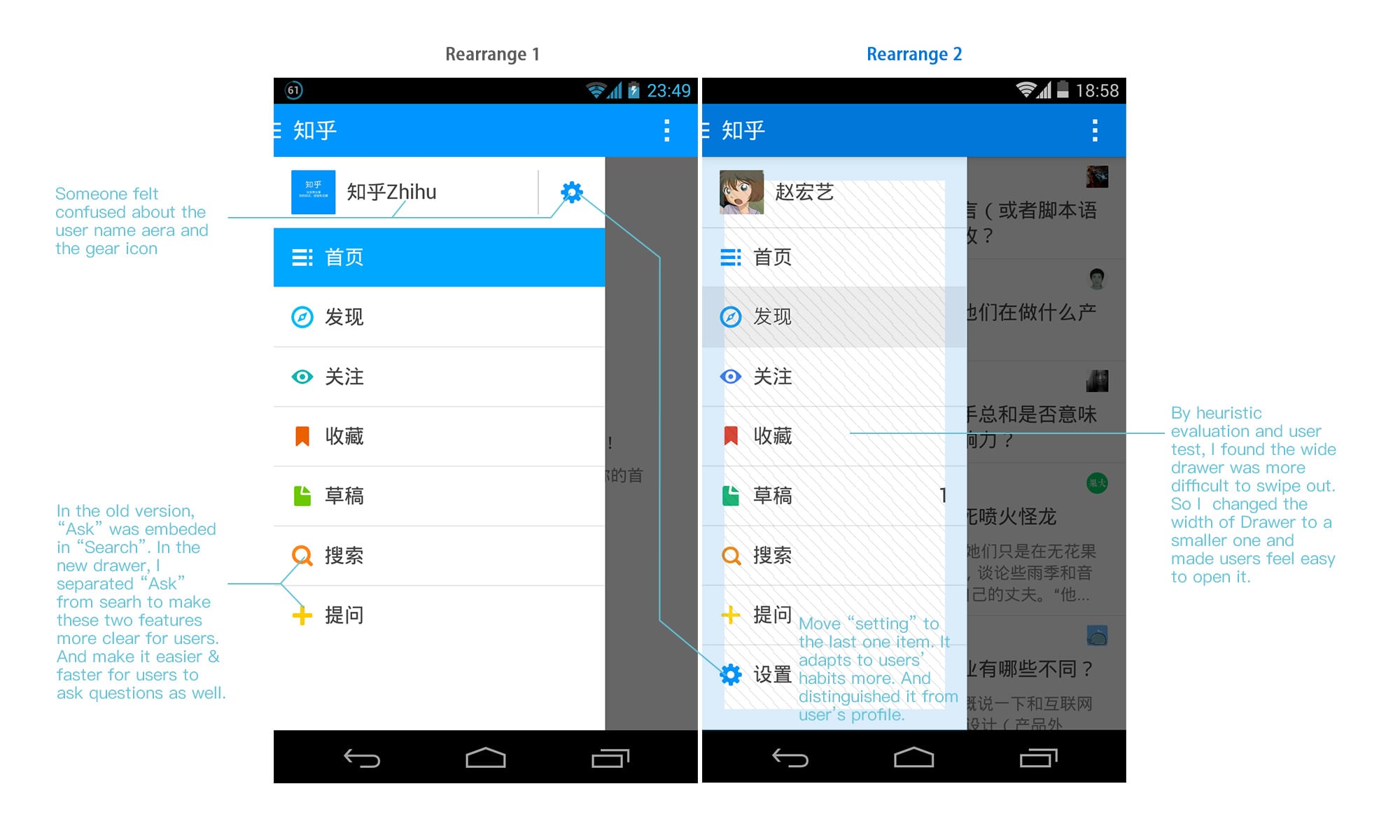
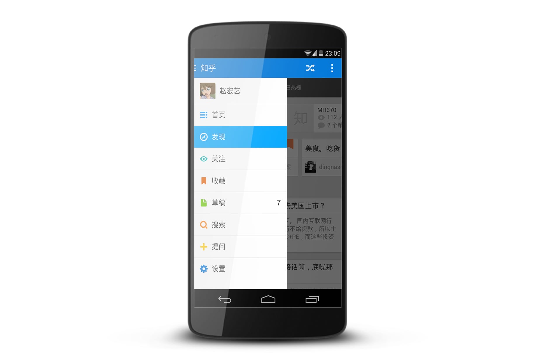
Rearrange Drawer by heuristic evaluation and users's test
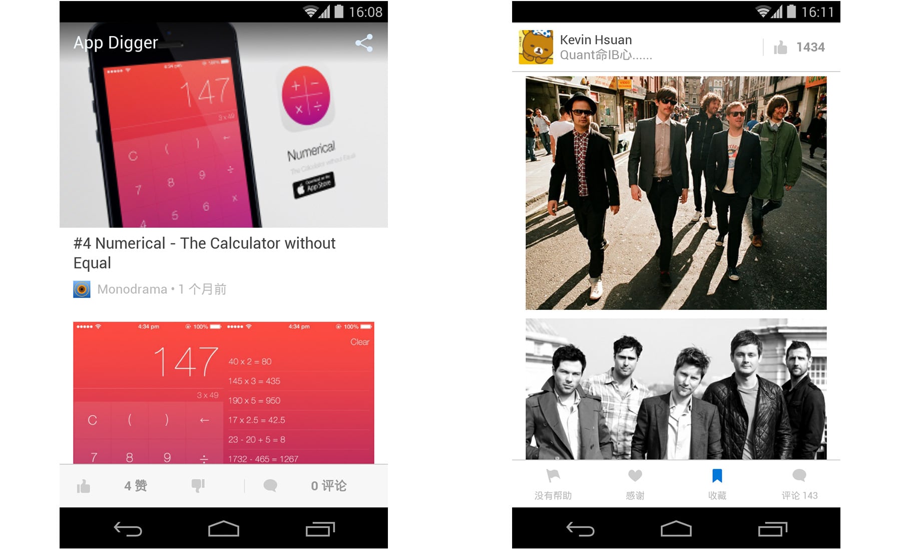
We refined the Answer pages and Article pages in order to make more space for reading by trying to make full screen for users to read.
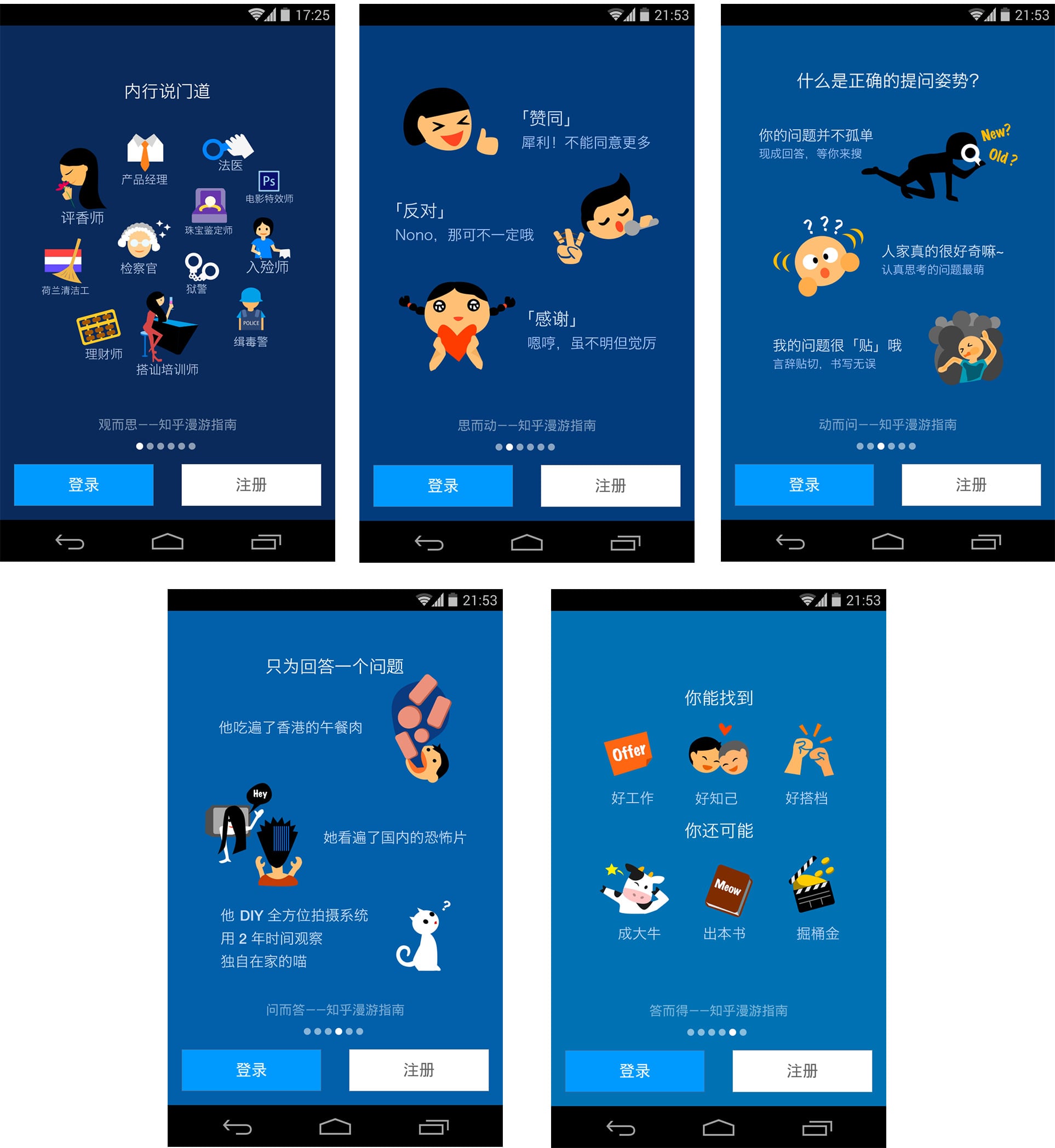
We drew 5 pages of illustrations with brief words to explain which features Zhihu has and what Zhihu can bring to our users.
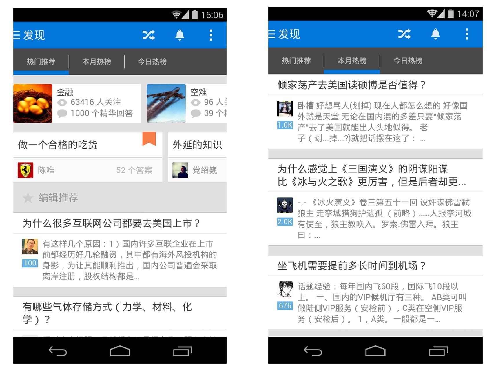
We redesigned the Explore page to present more kinds of information including Hot Topics/ Hot Collections/ Editor's Choice/ Hot Charts, so users could find more contents they may be interested in or curious about out of Feed.
Design exsits for people's need, it improves people's life and experience when they use an app or any tool. So I believe Android Design isn't only a rule for the Android Developers, but also a kind of principle that guide designers to create more well-experienced apps and satisfy people's needs in a consistent & better way.
See my answer on Zhihu to learn more about my opinion about System's Design Guideline.
© 2013 - 2021 HungI Zz.