
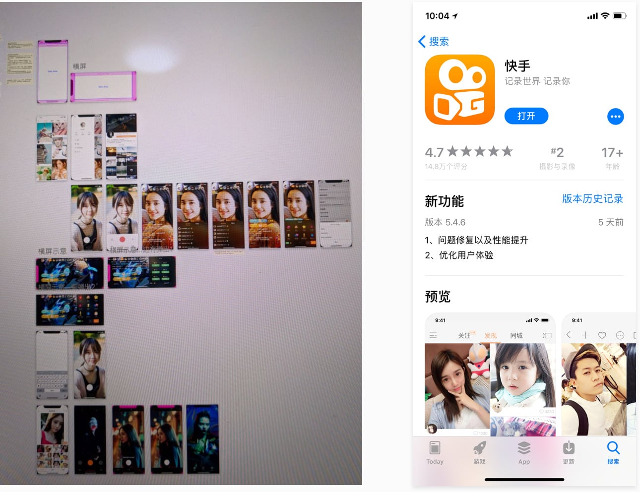
iPhone X is a brand-new edge-to-edge display device released by Apple Inc. in the autumn of 2017. As the largest and most popular short video product over China, Kwai App had to update its experience and design for iPhone X. The most special also the challenging part of this project was that iPhone X has a completely different shape & size of the screen with a set of new gesture rules for its basic interaction, but we had to complete all work before iPhone X’s shipped officially. That means we had no devices to preview and debug, and meanwhile, we didn’t have any references (competitor information) to learn from except the official iPhone X documentation from iOS Human Interface Guideline, which was really a big challenge for me, the only designer in this project, and the engineering team…
As the only one designer, in this project where there was no project manager, I pushed this project and collaborated with iOS engineers during the first three developing phases.
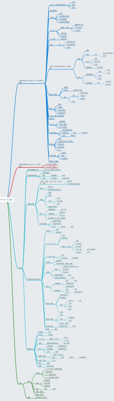
After taking over this task, I pushed my work by following steps:
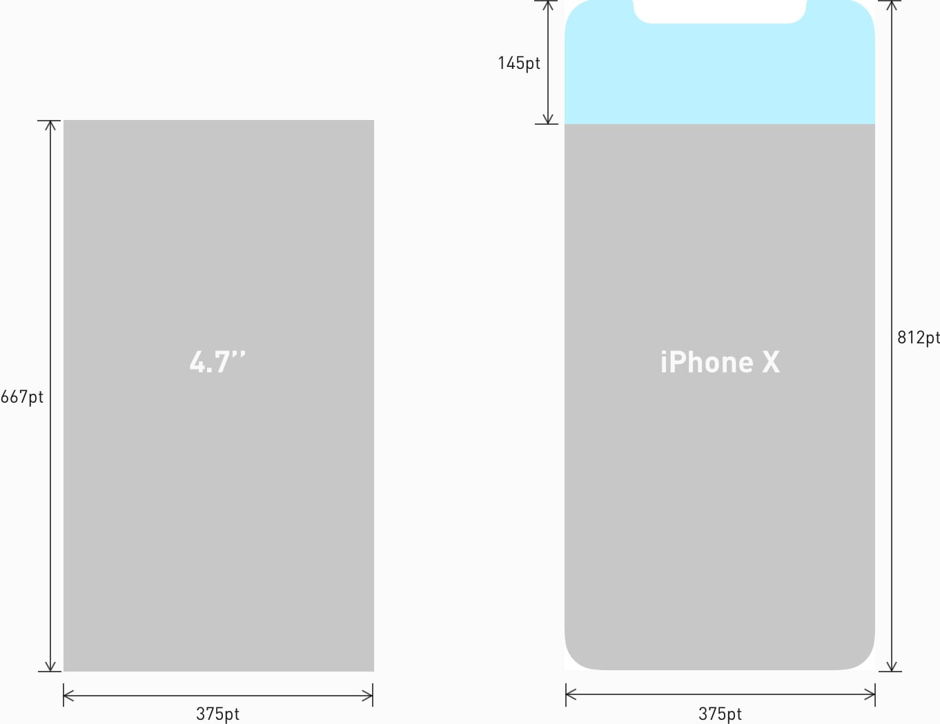
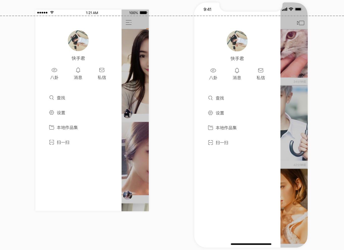
Old Screen vs Full Screen
Fill the screen and Inset essential content to prevent clipping. Must ensure that layouts fill the screen and UI elements & the essential content in the layouts don’t be obscured by iPhone X’s rounded corners, home indicator and sensor housing.
Don't mask or call special attention to key display features. Do not trying to decorate and hide the sensor housing, home indicator and rounded corners by any way.
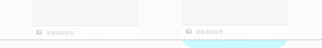
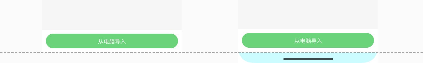
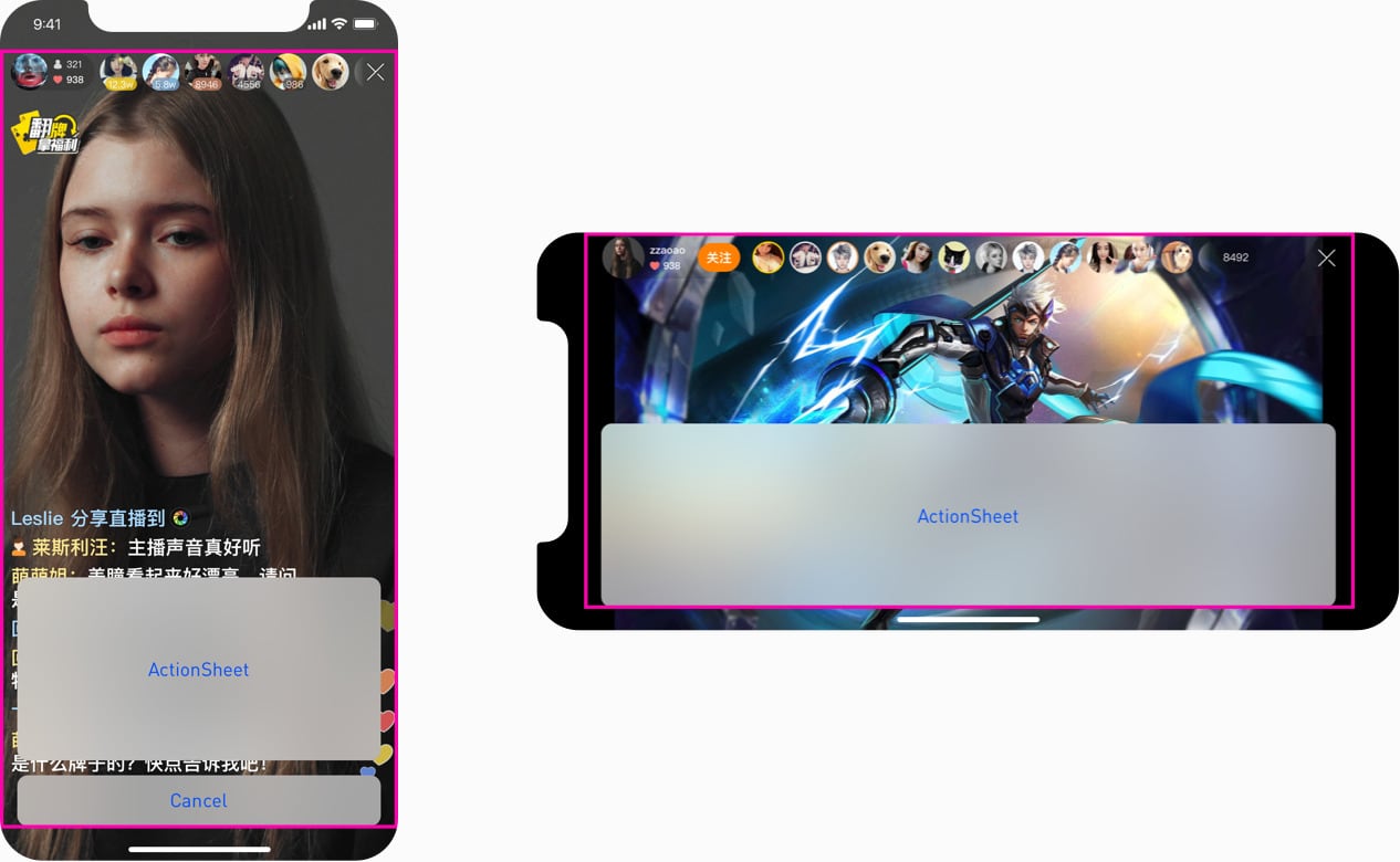
Avoid explicitly placing interactive controls at the very bottom of the screen and in corners. The gestures at the bottom edge of the display to access the Home screen and app switcher may cancel the custom gestures implemented in this area. Meanwhile you should reconsider the access of your key functionalities, becauce the far corner of the screen ( particularly the top-left area) can be difficult area for people to reach comfortably.
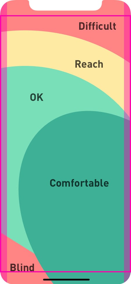
Left Hand
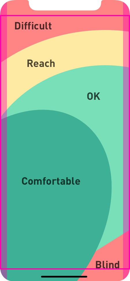
Right Hand
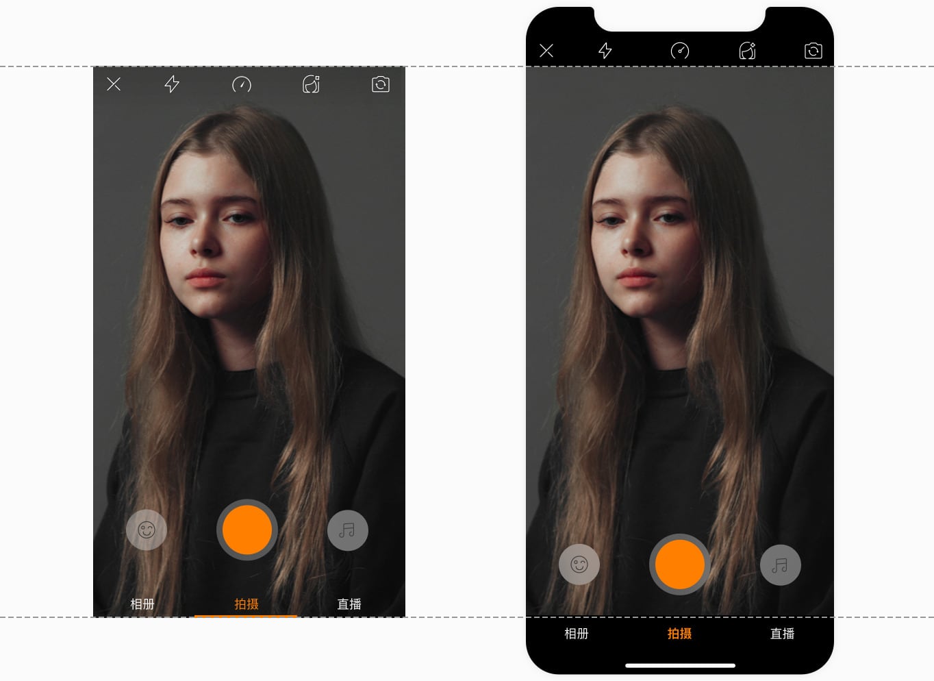
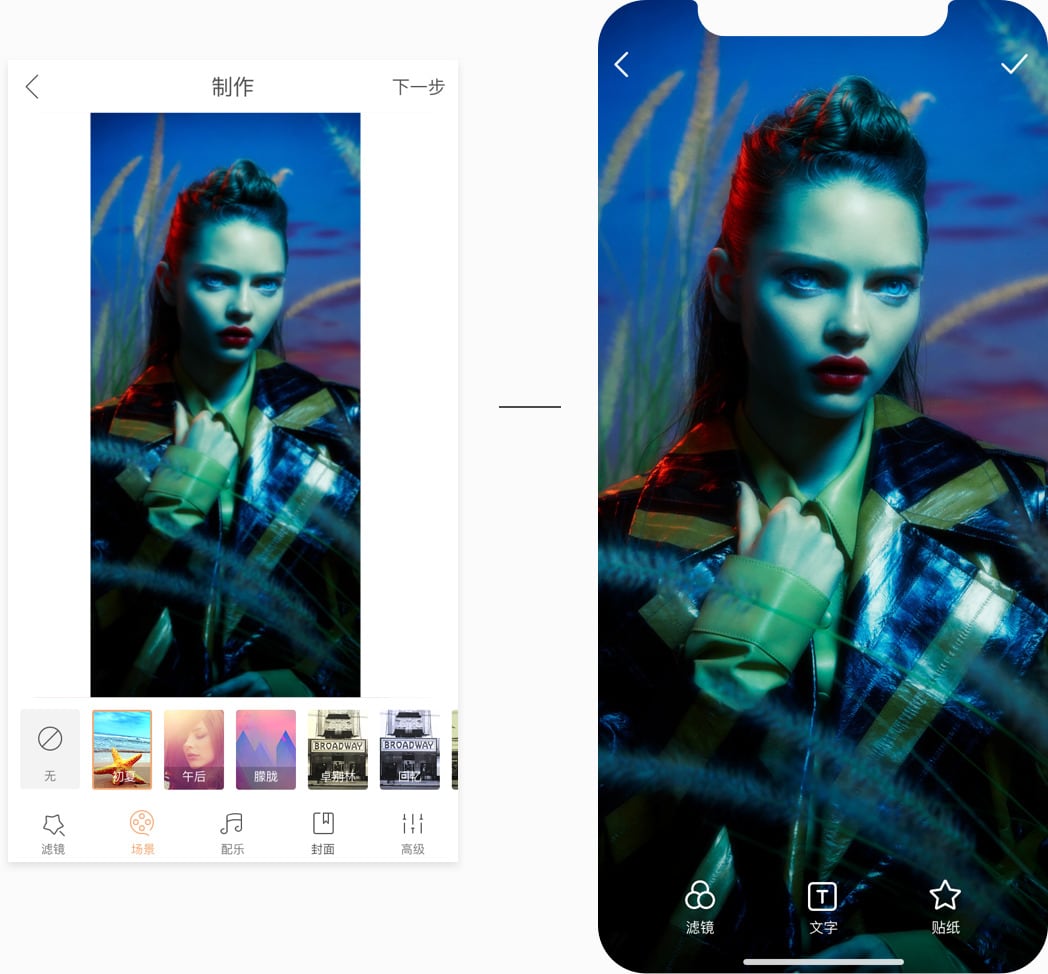
Provide a full-screen experience. Make sure backgrounds extend to the edges of the display, and that vertically scrollable layouts, like list view, tables (Grids) and collections, continue all the way to the bottom.
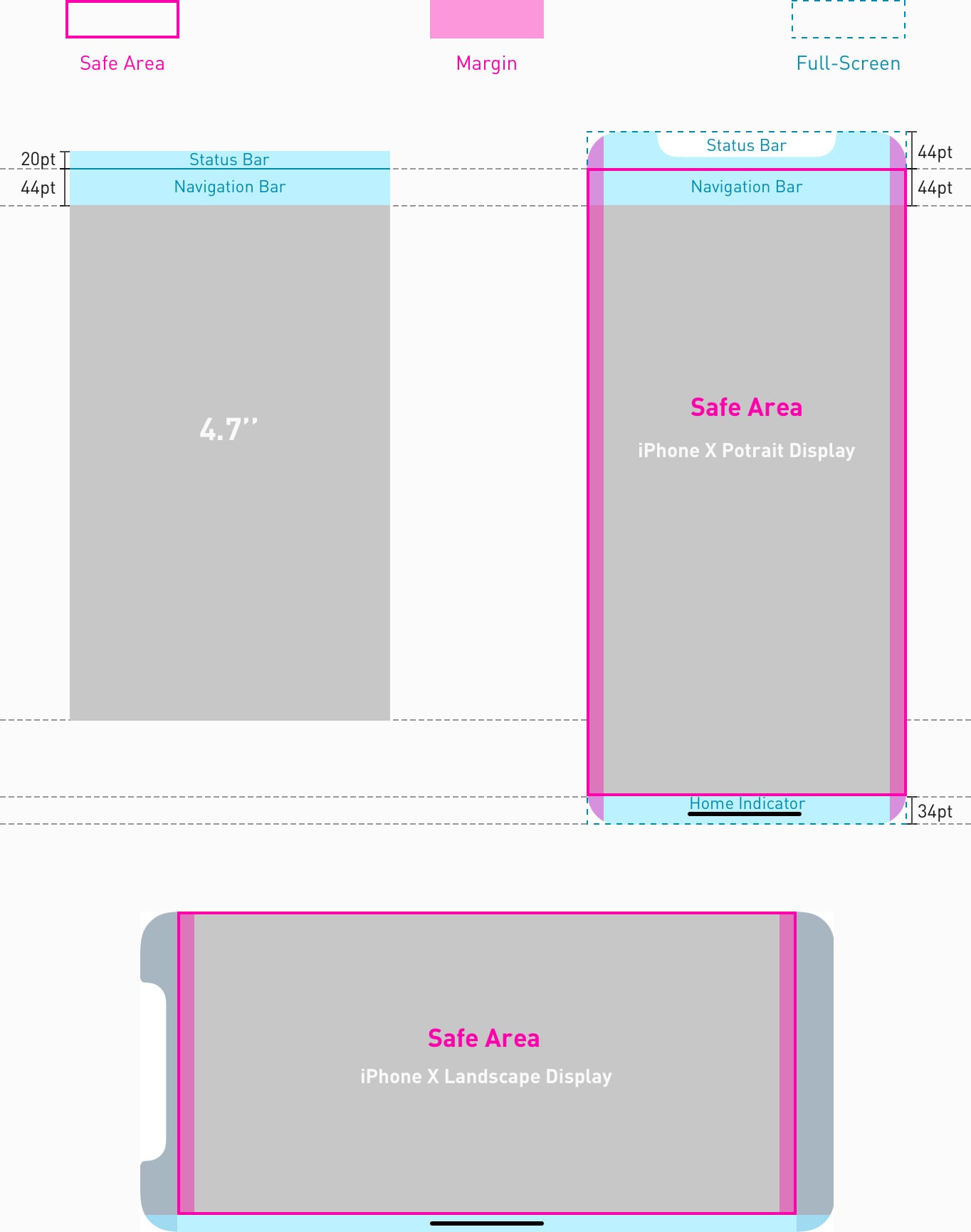
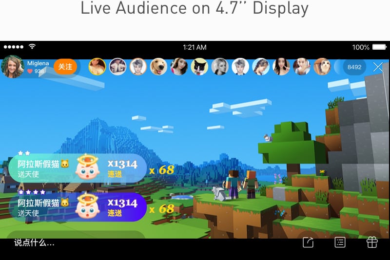
Do not hide the statusbar except there are additional valuable information having to be presented. In 4.7’’ display, we usually hide statusbar to provide full-screen experience to users. But the display on iPhone X provides more vertical space for content. As a result, the area status bar occupied may be not fully utilized. So presenting status bar can keep your screen visually balanced and provide more valuable status information to users as well.
Allow auto-hiding the home indicator sparingly to provide more immersive experience. When auto-hiding is enabled, the indicator fades out if the user hasn't touched the screen for a few seconds. It reappears when the user touches the screen again. Only when people stay in passive viewing experience like playing videos or photo slideshow, this behavior can be enable.
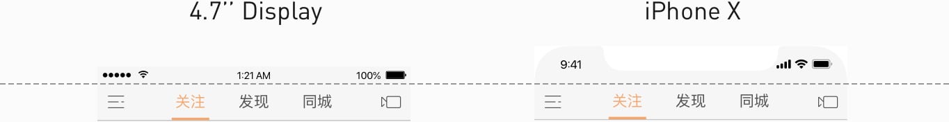
The height of navigation bar doesn’t change, only the height of status bar switches from 20pt to 44 pt.

All top bars without status bar add status bars area back.
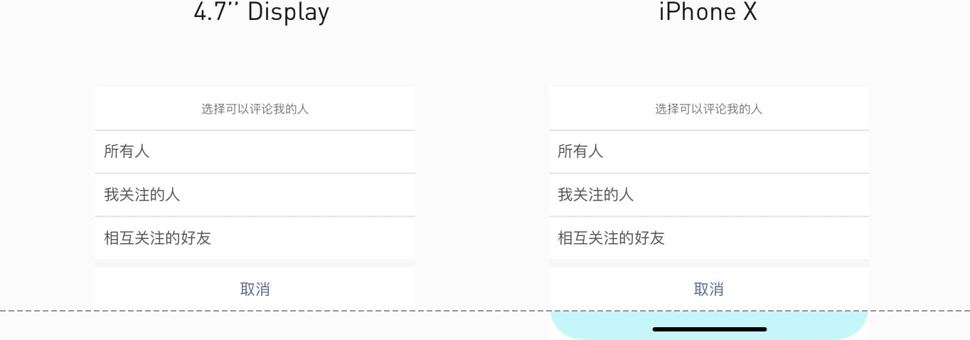
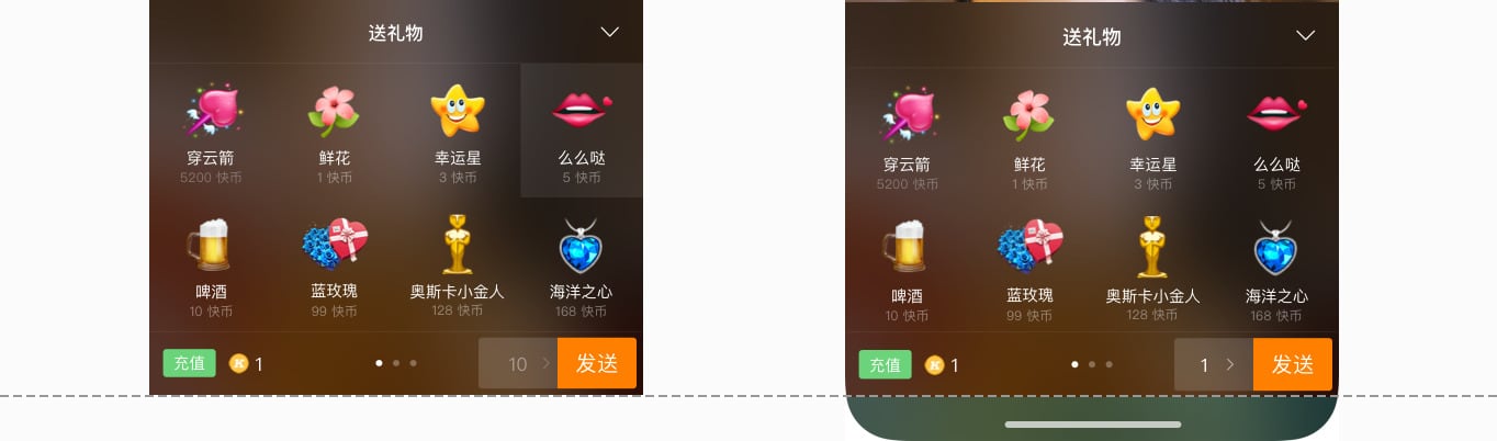
Bottom UI elements move up into the safe area, the backgrounds of the panel and bar extent to the bottom edge of the screen, with filling the background 34pt height of the home indicator area.
Inset all UI elements on the side panel of the landscpe display into the safe area.
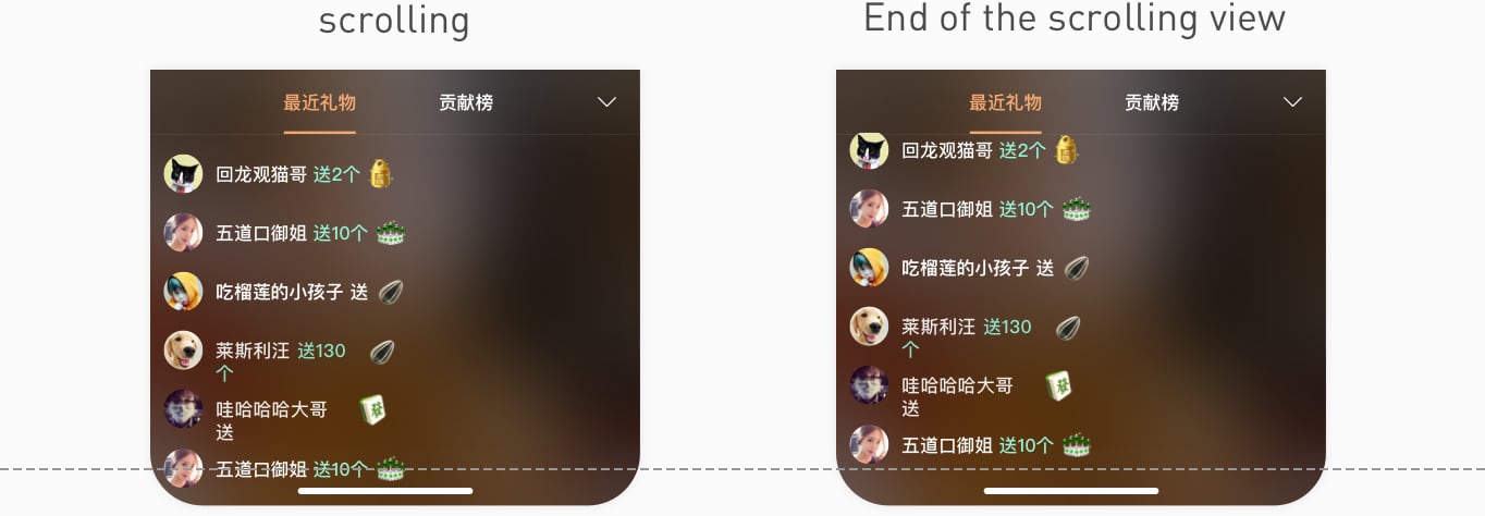
Lists or other scrolling views should extend to the bottom edge of the screen. Only when scrolled to the end of the view, the last item of the view should be positioned over the area of home indicator ( within the safe area) to prevent being obscured by the home indicator.
Based on the fact that the largest aspect ratio can be output by iOS’s camera is 16:9, and the principle - what you see is what you get, I made these adapting rules for production and consumption experience of Full-Screen Multimedia assets:
support users to produce videos and photos in 16:9 aspect ratio and shoot in a standard and consistent experience even on different devices.
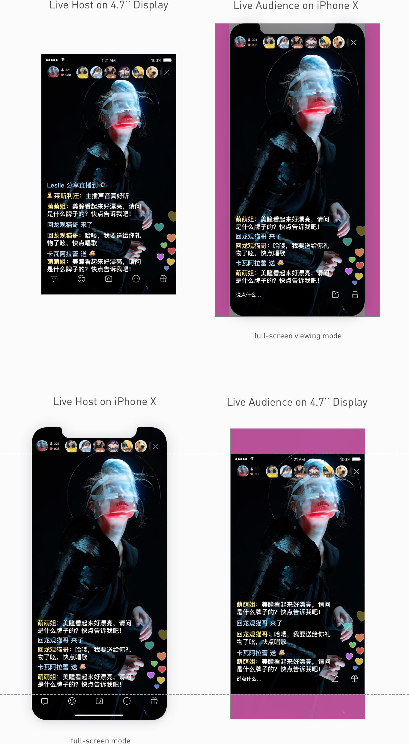
For general live display, I tried to provide the full - screen and immersive experience as much as possible.
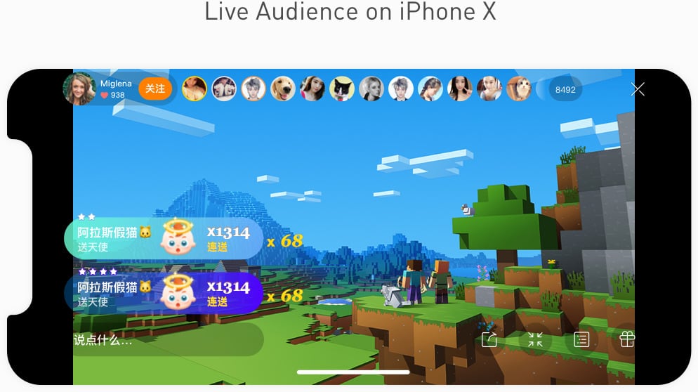
fit-to-screen viewing mode
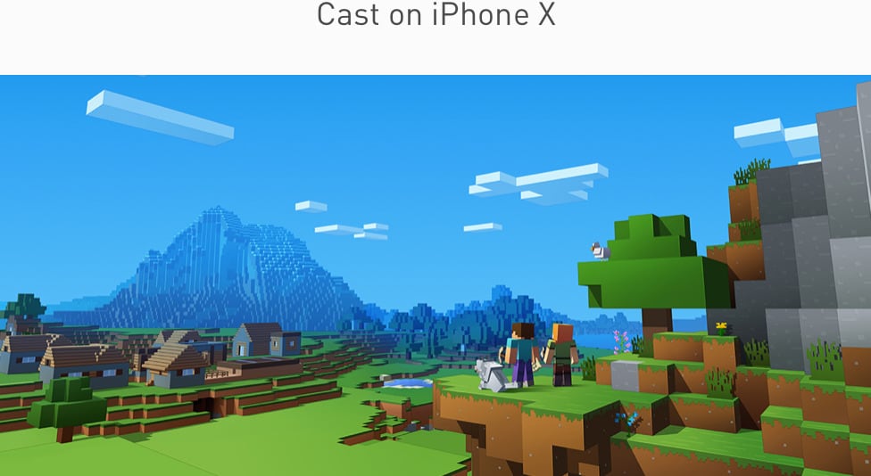
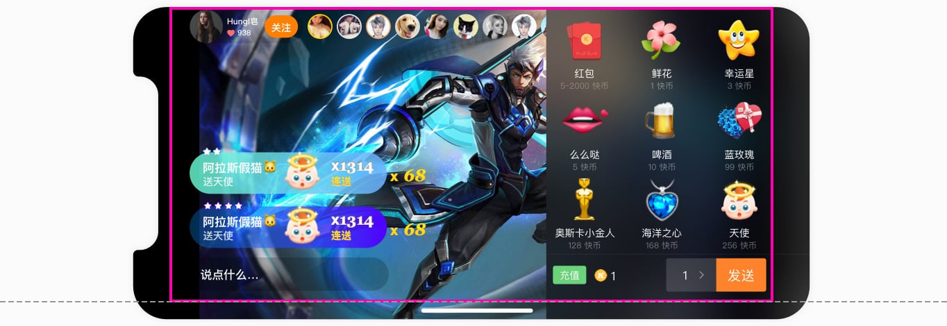
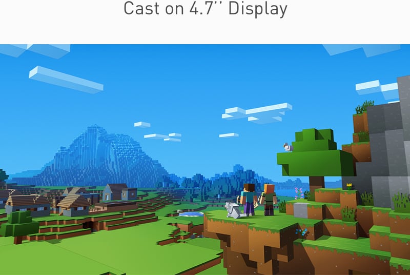
In the context of the game playing casting , I followed the principle - no original information loss, no clipping.
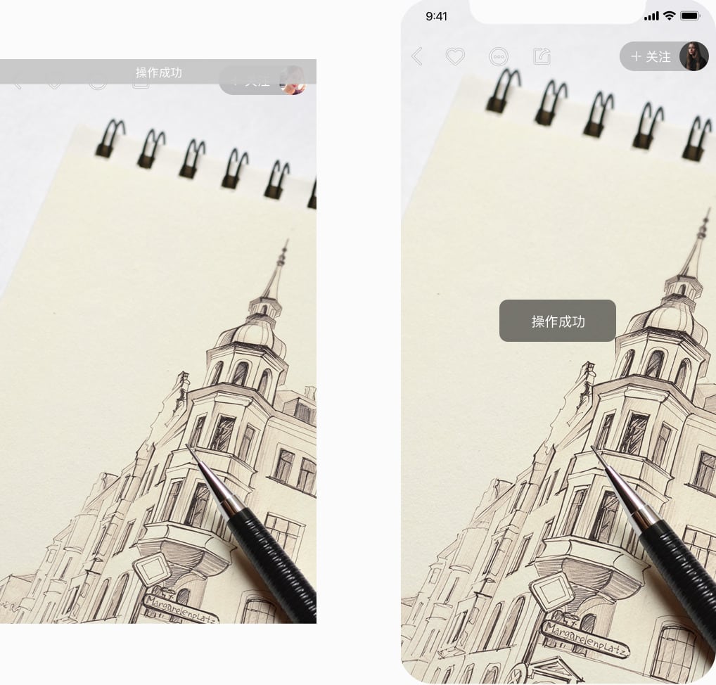
Top fixed toasts should be placed in the center of the view in the full-screen display .
It’s great to see my design works shipped by our awesome developers. Most the adapting design mentioned above was shipped in the previous three phases . Since there were lots of variations and nuances in the design, I used Google Docs and Sketch to detail out the adapting strategies and to design the adaptation layouts, and measure the specs. This helped a lot with minimizing the hand-off work. I also learned and practiced how to make a set of design strategies to cover all functional modules of a product in this process.
The follow-up implementing of the full-screen live experience would be continued with the number of Live hosts using iPhone X increasing.
With increasing number of edge-to-edge display devices’ releasing and popularizing, we would think further about the next generation design style for the full screen.
1. Foreground UI Elements don’t extent to the edge of the screen, particularly the bottom panels which need adapting in both portrait view and landscape view perfectly.
2. Take safe area into account.
3. Introduce responsive design thinking into mobile app design - a set of UI Elements can adapt themselves to any screen sizes. For instance:
4. Utilize full screen to provide users with more immersive and
high-quality contents and experience.
© 2013 - 2021 HungI Zz.